Migration in the U.S. – Monday Map
A informative migration map showing what percentage of each state was born there.
It also shows where the largest groups of migrants came from. Some interesting surprises as migration shifts across the years.
Clicking on this migration map takes you to a page at nytimes.com where one may compare these figures with those from 1900 and 1950.
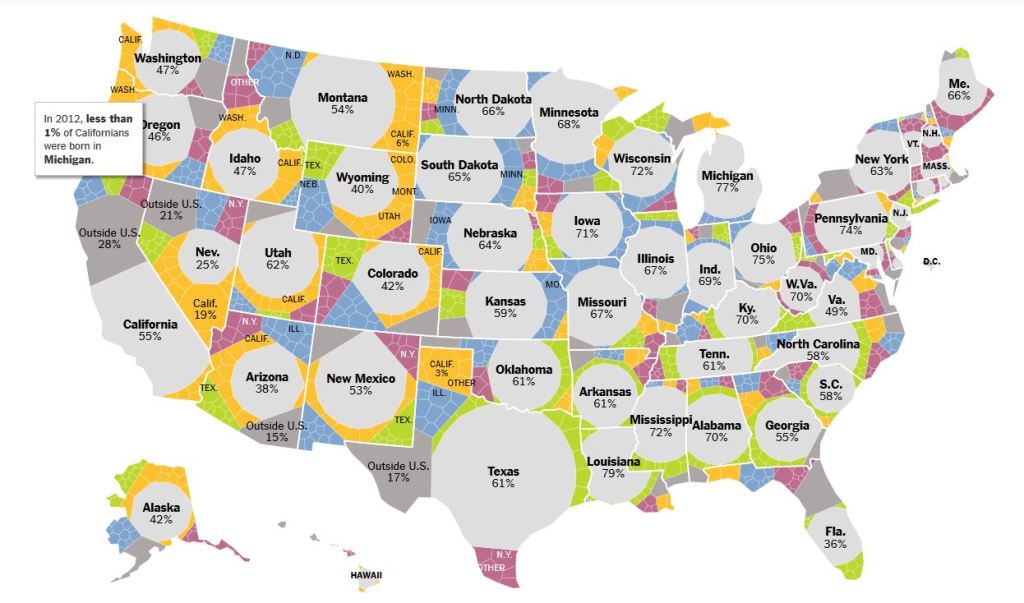
Colors representing migrant origins
Red – Northeast
Green -South
Blue – Midwest
Yellow – West
Gray – Outside the U.S.
Significant migration from specific states is labeled as well.
~
I found it fascinating that the southern states only about half of the southern states are comprised of natives, compared to nearly 90% on average in average in 1900, while the western states had incredible incoming migration over the past century and now retain most of their native born residents.
~
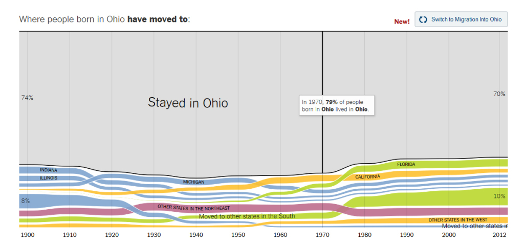
This map is related to a series of charts showing a state by state history of who came and who went and where they went.
~